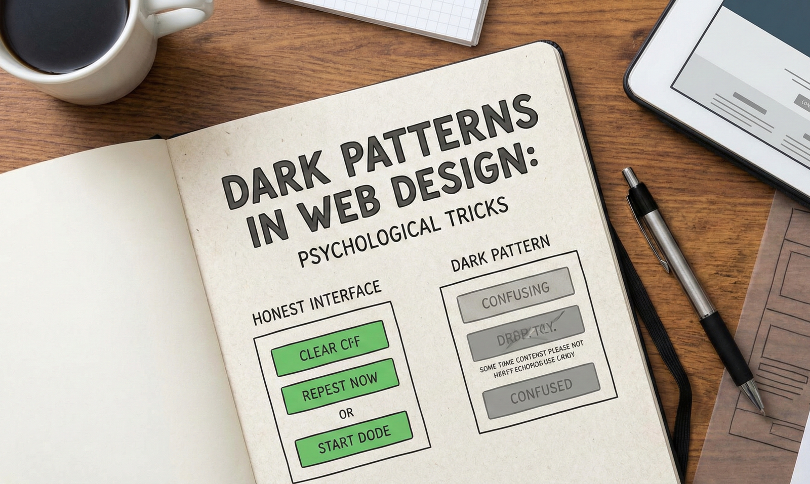
Have you ever found yourself subscribed to a newsletter you don’t remember signing up for? Or perhaps you’ve struggled for twenty minutes just to find the “Delete Account” button, which seems to be buried deep within a labyrinth of settings menus?
These are not accidents. They are Dark Patterns—user interface (UI) design choices that have been carefully crafted to trick users into doing things they might not otherwise do, such as buying insurance with their purchase or signing up for recurring bills.
For psychologists and web developers alike, Dark Patterns represent a fascinating, albeit unethical, application of behavioral psychology. They exploit the quirks of human cognition—our biases, heuristics, and limited attention spans—to maximize corporate metrics at the expense of user autonomy.
What Are Dark Patterns?
The term was coined in 2010 by UX specialist Harry Brignull. He defined them as features of interface design crafted to trick users into doing things, such as buying overpriced insurance with their purchase or signing up for recurring bills.
Unlike “bad design,” which is simply clumsy or confusing, Dark Patterns are deceptive by design. They rely on a deep understanding of human psychology to manipulate decision-making processes.
The Psychology: Why Do We Fall for It?
To understand why Dark Patterns work, we must look at Dual Process Theory, popularized by psychologist Daniel Kahneman.
- System 1 (Fast Thinking): This is automatic, intuitive, and unconscious. It relies on heuristics (mental shortcuts) to make quick decisions with minimal effort.
- System 2 (Slow Thinking): This is analytical, logical, and conscious. It requires effort and attention.
When we browse the web, we are almost exclusively using System 1. We scan pages rather than reading them. We look for visual cues (colors, large buttons) to guide us. Dark Patterns weaponize this “lazy” cognitive state. They create a path of least resistance that benefits the company, not the user.
Key Cognitive Biases Exploited
- The Scarcity Bias:
- Social Proof:
- The Trick: “38 people are looking at this item right now.”
- The Psychology: When uncertain, we look to others for cues on how to behave. Dark patterns fake or exaggerate this social activity to validate a purchase.
- The Sunk Cost Fallacy:
- The Trick: You spend 10 minutes customizing a product or filling out a form, only to be hit with a surprise fee at the very last step.
- The Psychology: Because you have already invested time and effort (sunk costs), you are more likely to pay the fee than to “waste” the work you’ve already done.
- Default Bias (The Path of Least Resistance):
- The Trick: Pre-ticked checkboxes for newsletters or extra services.
- The Psychology: Humans have a strong tendency to stick with the default option because it requires less cognitive load than making an active change.
Common Types of Dark Patterns
Brignull identified several specific types of deceptive patterns. Here are the most psychologically potent ones:
1. The Roach Motel
This design makes it very easy to get into a situation (like a subscription) but incredibly difficult to get out of it.
- Example: You can sign up for a premium service with one click, but to cancel, you must call a support line during business hours or mail a physical letter.
2. Confirmshaming
This technique uses manipulative language to guilt the user into opting into something. The option to decline is often phrased to insult the user.
- Example: A popup asks for your email to get a discount. The “No” button says, “No thanks, I hate saving money.” This exploits our desire to avoid cognitive dissonance—we don’t want to identify as someone who makes “bad” choices.
3. Misdirection
The interface focuses your attention on one thing in order to distract you from another.
- Example: A “Continue” button is bright green and huge, while the “No thanks, continue with free version” link is grey text on a grey background, effectively camouflaged. This exploits our selective attention.
4. Forced Continuity
When your free trial with a service comes to an end and your credit card starts getting charged without any warning.
- Example: A streaming service requires a credit card for a “free” trial and silently upgrades you to a paid plan without an email reminder, banking on your forgetfulness.
5. Privacy Zuckering
Named after Facebook CEO Mark Zuckerberg, this is the act of tricking you into sharing more information about yourself than you really intended to.
- Example: Convoluted Terms of Service agreements or confusing privacy settings that default to “Public.”
The Ethical and Legal Frontier
From a psychological perspective, Dark Patterns are a form of coercive control. They remove informed consent by obscuring information or manipulating emotional states.
The tide is slowly turning. Laws like the GDPR in Europe and the CCPA in California are beginning to specifically target these practices, mandating “Privacy by Design.” UX designers are increasingly advocating for ethical standards, arguing that while Dark Patterns may boost short-term metrics (like click-through rates), they destroy long-term brand trust.
How to Protect Yourself
- Slow Down (Engage System 2): When you feel rushed by a countdown timer or a “limited supply” warning, pause. Take a breath to disengage your automatic panic response.
- Read the Small Print: Look for pre-ticked boxes or greyed-out text links.
- Be Wary of “Free”: If you have to enter a credit card for a free trial, set a reminder on your phone immediately to cancel it.
Conclusion
Dark Patterns are where psychology meets capitalism in the digital age. By understanding the cognitive biases these designs exploit, we can become more resilient users. For developers and psychologists, the goal should be to build “Honest Interfaces”—designs that respect the user’s time, attention, and autonomy.


